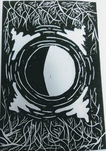
Title: Illuminating The Dark
Size: 23 cm x 15 cm
Medium: Block Printing
Date: January 2019
Exhibition Text
"Illuminating The Dark" is a piece inspired by Vincent van Gogh's "The Starry Night" and "Solitude" by Daler Usmonov. Each of their pieces represents darkness, Van Gogh's painting a literal night, and Usmonov using darkness to signify loneliness. My piece uses darkness aswell, but not as you would think. My piece signifies that even though darkness may come, it can still create light. Darkness drives light, and in this piece, the darkness is Illuminating.
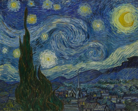
"The Starry Night" by Vincent van Gogh. Retrieved from http://www.moma.org/learn/moma_learning/vincent-van-gogh-the-starry-night-1889/.
|
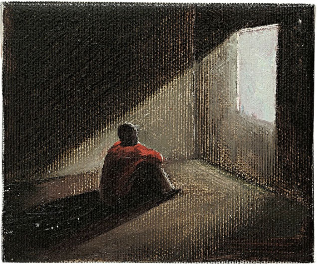
"Solitude" by Daler Usmonov. Retrieved from https://artsandculture.google.com/asset/daler-usmonov-solitude/qgGIU_KrzLZYfw.
|
Inspiration / Research
Vincent van Gogh's most famous piece in my opinion was "The Starry Night" which he painted in a mental asylum. At this time he used art to relax himself, as it was all he could find to do so in the asylum. "The Starry Night" represents the beauty in the night sky through mixtures of colors light and dark. In my piece, I did the opposite, I used only black and white to signify not beauty, but to create the feeling of darkness reflecting light. Also, van Gogh creates movement and light using small line around the moon, I used this idea of expanding light as the focus of my piece.
Daler Usmonov, he is a lesser know modern artist who work primarily with painting. His piece "Solitude" was created to address feeling of isolation, and loneliness. Notice that in this piece he places darkness not in direct relations with loneliness, but light is mainly what shows this. The light is what shows that isolation or solitude. In my piece I decided to change darkness to mean unfortunate events, or bad things that happen, but I also challenge a common way of thinking. The darkness though still darkness, gives off light, and that light is created by darkness. Darkness creates light, and light can create darkness, they are interconnected.
Daler Usmonov, he is a lesser know modern artist who work primarily with painting. His piece "Solitude" was created to address feeling of isolation, and loneliness. Notice that in this piece he places darkness not in direct relations with loneliness, but light is mainly what shows this. The light is what shows that isolation or solitude. In my piece I decided to change darkness to mean unfortunate events, or bad things that happen, but I also challenge a common way of thinking. The darkness though still darkness, gives off light, and that light is created by darkness. Darkness creates light, and light can create darkness, they are interconnected.
Techniques
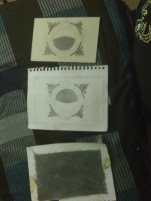
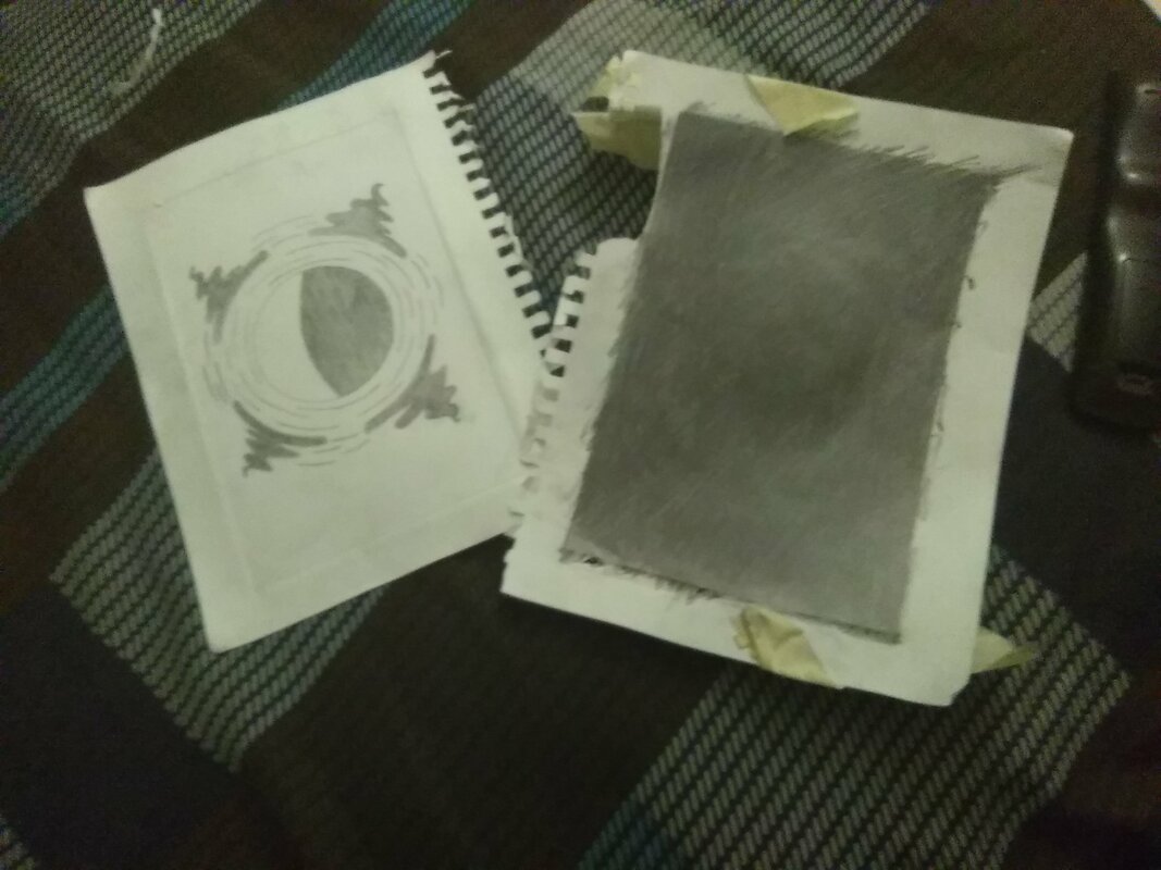
To create "Illuminating The Dark" I had to find a way to show how the final piece would be. I used pencil led to show where I would have to carve. That area would in the final piece would be white and the rest of the piece would be black.
When carving, I didn't have a tool to keep it in place, so I had to freehand the carving. This is seen in the pictures, on the carved plate there are large parts that are carved different way. This was just overall easier due to the lack of supplies I had at home. As for the printing process, I tried to use a minimal amount of ink, so the ink wouldn't seep into the smaller, thin carves that I made representing the branches of a tree.
When carving, I didn't have a tool to keep it in place, so I had to freehand the carving. This is seen in the pictures, on the carved plate there are large parts that are carved different way. This was just overall easier due to the lack of supplies I had at home. As for the printing process, I tried to use a minimal amount of ink, so the ink wouldn't seep into the smaller, thin carves that I made representing the branches of a tree.

Process
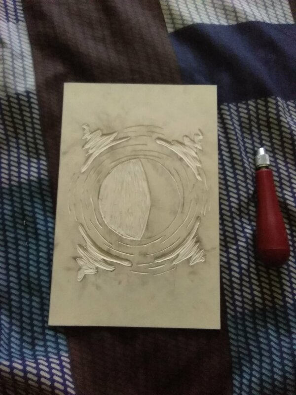
First, I traced the plate twice into my sketchbook inorder to have the correct measurements in my sketch. I drew the "base" of the artwork which was a circle (traced with a roll of scotch tape) placed directly into the middle of the sketch. I then used the tape roll to create another cicle surrounding the center circle. I added the swaying, bolder lines to contrast with the black that would be in the final project. I added the smaller lines of light coming from that larger circle, and then erased the larger circle completely.
After the sketch was done, I transfered my sketch over to the plate. I placed the plate down, and taped it to the sketch. I then used a pencil to push the lead from thr sketch to the plate. I did this by coloring the entire backside of the sketch with pencil lead. It transfered cleanly to the plate and I started to carve into the plate.
Carving into the plate was difficult at first, so I used my practice piece to find a way to carve cleanly into the plate. Using a small amount of pressure worked very well, and so I started on the final plate. After the main carving was done, I noticed how there was so much empty space. I then brainstormed the idea of tree branches in the night sky which would compliment my center piece of a strong, majorily white moon. I free handed the branches to show the natural movement of the branches. I then added them to the other side to create a balance to the piece as a whole.
The carving process was done, now I had to print it. First in the printing process, I had to place a small amount of water based ink onto a tray. I used a roller to spread the ink on the tray, and after the ink was spread out on the tray I got the roller and got more ink on it. I then rolled it flat across my plate, while being very cautious of the large cared space I had in the center of the piece. After I thought the correct amount of ink was spread on the plate I placed a clean sheet of drawing paper onto the plate, making sure to evenly place it. I then used a brayer to transfer that ink over to the drawing paper. After a good amount of pushing with the brayer, I took the drawing paper off the plate and looked at the product. I repeated this process until I had a perfect print (or as close as I could get) to put on the drying rack.
Experimentation
|
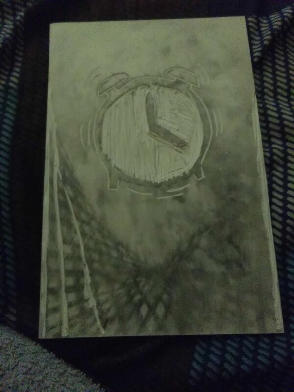
The original theme of my piece was supposed to be time and how it's wasted. But I ran into issues while creating the piece, the clock has to have reversed numbers, and it was difficult to invision it as a final piece. Also using the whole plate was difficult when trying to find something that went with the theme of the piece. Because of this, I switched my idea, so I could add with my previous piece, "Luminescent Branches" so both of these pieces could compliment each other with the color contrast, space, and balance.
When carving I used a practice plate from the previous idea, so I could see what each of the three tools were good for. I experimented with how accurate I could get with the carving and to find the best way to carve. When I was finished with the practice piece, I went to the final plate. With the final plate I used different angles, and force to carve into the larger areas. I was sort of forced to because I carved at home, and at home I didn't have all the tools that I did at school. I went through the printing process several times, using more/less ink on the plate. I also changed up the pressure I was using when using the brayer to transfer ink, and I found that lots of ink with a heavy amount of pressure forces the ink into the carved areas which is not good. The best way to print was a decent amount of ink using lot of pressure, that way the ink transfers and doesn't spread so quickly. |
|
Planning
My original theme didn't turn out the best, so I decided to do a continuation of the theme from my previous piece "Luminescent Branches". This piece wouldn't be just a tree though, this piece had to have some aspect of what I used in the other piece. I decided to show a moon at night emitting light from the light and dark side the same. This weird light effect from the darker side would be considered illumination. Same as the previous piece, this would show that darkness can't be gotten rid of, but it can be used to create and support the light. The larger pools of light are placed around the moon to help signify the light being emitted, and to support the contrast of white and black that will be in the final piece.
Reflection
I believe that even though this piece was created fairly quick, it turned out really well. The contrast from light to dark is really great, and will be even better put next to my piece "Luminescent Branches". If I spent even more time printing however, I would have had a better product. You can see some white dots throughout the piece which was not intentional. Something makes me feel like the large spools of light can be replaced with something else, however I don't quite know what. The contrast and highlight of the spools are very significant to the look of the piece. Also the mixture of the lines show a unity between the tree and the moon, which really helps express the feeling of darkness being able to create light.
I also believe that I could have used more of Van Gogh's style instead of those four large spools of light. Maybe even smaller lines inbetween, though I don't want to crowd center of the piece. Being only in black and white, I feel like I could have played around with the usage of white as van Gogh does when he plays around with the colors to create movement. Overall, this is a solid piece that I really enjoyed creating, and I can't wait to make more in the future.
I also believe that I could have used more of Van Gogh's style instead of those four large spools of light. Maybe even smaller lines inbetween, though I don't want to crowd center of the piece. Being only in black and white, I feel like I could have played around with the usage of white as van Gogh does when he plays around with the colors to create movement. Overall, this is a solid piece that I really enjoyed creating, and I can't wait to make more in the future.
ACT Questions
Clearly explain how you are able to identify the cause effect relationship between your inspiration and its effect on your artwork?
Vincent van Gogh's "The Starry Night" ushered in a new way of showing light, through smaller lines created using different color. I on the other hand used no color when creating the light for my piece, . But that was because the contrasting themes we had on each piece of artwork. I was comparing darkness and light therefore my piece would understandably have no color, while van Gogh focused on beauty, which when you think beauty you think colors, blends, ect.
What is the overall approach the author has regarding the topic of your inspiration?
Vincent van Gogh approaches beauty in the night through a use of many different colors, light and dark. He also blended those colors together, creating unity throughout his piece.
What kind of generalizations and conclusions have you discovered about people, ideas, culture, etc. while you researched your inspiration?
People often associate darkness with evil, and light with good even though they create one another. A lack of light creates darkness, and a lack of darkness creates light.
What is the central idea or theme around your inspirational research?.
The beauty of light and dark, and also a comparison of the two. Whether that be in an artistic way to create color contrast and highlight, or a meaningful way, such as perseverance in dark times, or even both.
What kind of inferences did you make while reading your research?
I assumed that while Vincent van Gogh created "The Starry Night", he may of had some idea on what colors to use, but he mostly played around with colors to create the movement.
Reference Page
Gogh, Vincent Van. "MoMA Learning." Lee Bontecou. Untitled. 1959 | MoMA. Accessed February 06, 2019. https://www.moma.org/learn/moma_learning/vincent-van-gogh-the-starry-night-1889/.
Usmonov, Darel. "Solitude." Google. Accessed February 06, 2019. https://artsandculture.google.com/asset/daler-usmonov-solitude/qgGIU_KrzLZYfw.
Usmonov, Darel. "Solitude." Google. Accessed February 06, 2019. https://artsandculture.google.com/asset/daler-usmonov-solitude/qgGIU_KrzLZYfw.
