MIAD Project
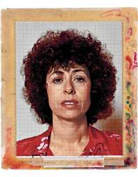
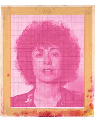
"Linda" by Chuck Close retrieved from http://chuckclose.com/work059.html
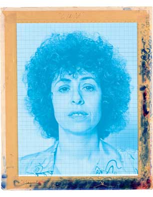
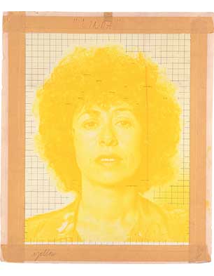
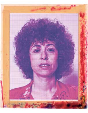
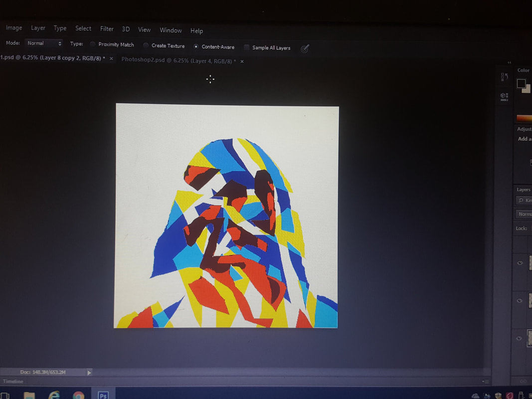
Color Adaptations of "Linda" by Chuck Close retrieved from http://chuckclose.com/work059.html
|
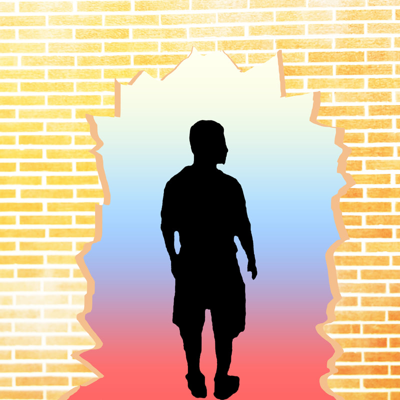
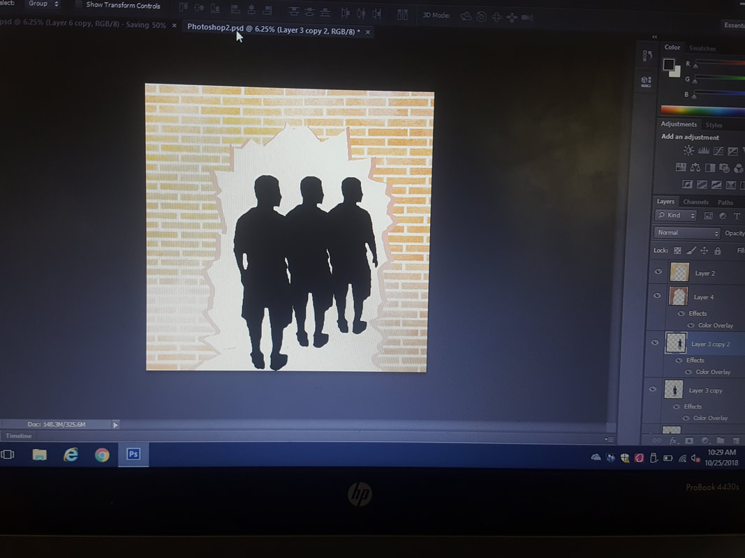
Titles: "Equal In Color" &"Wall Of Reality"
Size: 91 cm x 91 cm Medium: Digital Manipulation & Silk Screening Completion: 2018 November Exhibition Text "Equal In Color" and "Wall Of Reality" are both Mixed Media pieces, (Digital Manipulation and Silk Screening). The theme given to us by MIAD Professor and Artist Jason Yi, was that of community and culture. For inspiration I used "Linda" by Chuck Close, and the color adaptations from "Linda". These artworks recognize Milwaukee for what is seen on the outside, the beauty, while also showing what goes on behind the scenes, the segregation, inequality.
Inspiration/Research My inspiration was not just the single piece "Linda" by Chuck Close, but also the color adaptations of the piece. Chuck Close is known for his ability to create realistic images, that capture all imperfections of a person. My ideal for making these pieces were to combat that idea of imperfections make the person. These pieces are also each inspired by Milwaukee and it's history as a community and culture. Milwaukee is known for segregation, before the Civil Rights Movement even being in the North, housing segregation was huge in Milwaukee. Segregation since then has been "toned down" as many people believe. Milwaukee is considered the worst place in America for Adult Male African Americans. They suspend black students at double the national average, over 50% of black men between their 30's and 40's have been incarcerated, and political/racial borders have been clearly defined. Most whites are in the suburbs, while Hispanics make up the South, Asian-Americans make up the West, and Blacks make up the north. If you lived in Milwaukee for a long enough time, this isn't a surprise to most, but it's hidden deep in the roots of the Brew City, and it needs to come out. I believed that this hidden truth needed to be revealed, regardless of how much beauty there is.
|
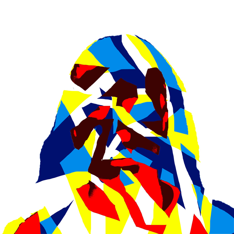
Planning Thinking about community and culture, color of a persons skin has a big determination of that in main stream society. I decided to show zero detail, no facial features, nothing that could determine deference but one solid color. I did this to flip Chuck Close's belief of capturing imperfections to show identity. I am showing in the piece "Equal In Color" that imperfections and genetics (how you look) don't identify a person, not as a culture or a community.
Milwaukee as a whole, is a beautiful place to live... but not for everybody. That wall of beauty overshadows what is truly going on in Milwaukee, that's why in my piece "Wall Of Reality" the wall is being broken down to reveal the truth. The flowers on the wall further signify the "beauty wall" being torn down. I wanted to show a positive image with "Equal" and the flowers, something that hides the real meaning of the piece. It takes true thought in the piece to determine what is trying to be said. Technique Digital Manipulation was the first choice that I made in this project. Since my previous piece "Acknowledgement Of Self" I've wanted to dive further into Photoshop, to really see what I could do. But the process of creating became a huge question mark, and the things i did like contorting the images, and enlarging certain facial features, made my general idea too hard to grasp. So I went with a basic approach, and it really cleared up what the piece needed to be. The piece needed to be a symbol for change, not a journey into Photoshop.
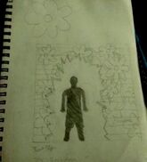
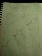
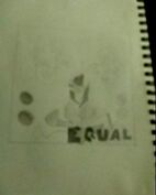
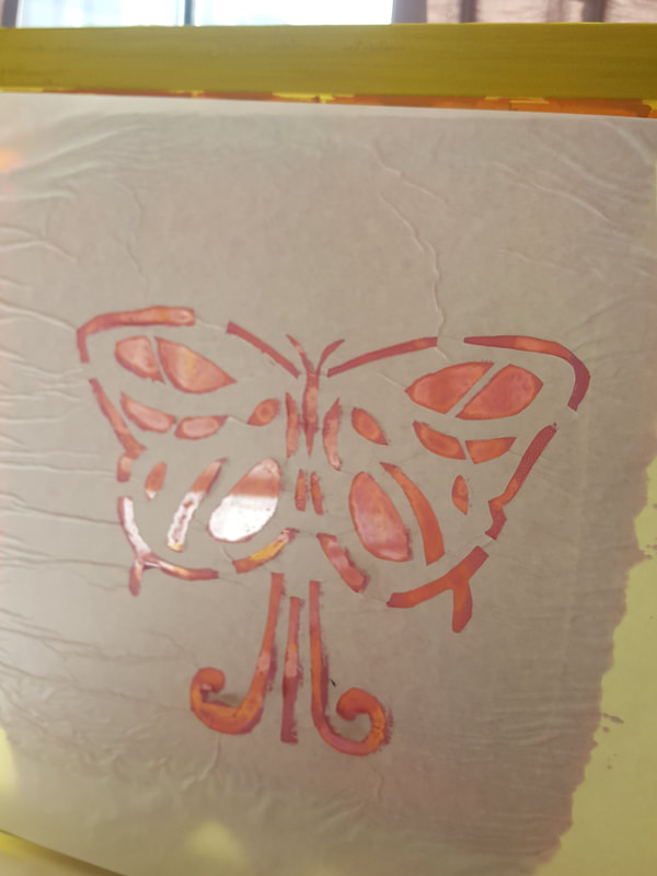
Experimentation I went through multiple stages and ideas before I actually had the full idea for the final pieces. This is less for "Wall Of Reality" because as you can see in the sketches, I had a very detailed idea that devolved as the process went on. First I wanted to make the wall look vibrant and colorful, but as time progressed I realized that all the colors would disrupt the piece's meaning, adding too much beauty would take away from the pain, just like the beauty of Milwaukee hides the reality. For "Equal In Color" I ventured through multiple different ideas as you can see in the sketches. I went from being able to see all four people which would show the diversity of Milwaukee, but that idea wasn't real enough to me. Then the sketch of all four people again but with the words "diversity" and "segregation" on each half of the piece. But that didn't require enough thought, so I decided on the puzzle piece or broken picture to signify the diversity, the butterfly to signify the beauty, and "EQUAL" to make a statement on inequality.
|
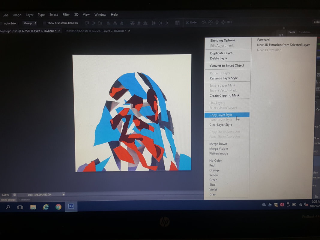
Process First for "Equal In Color" & "Wall Of Reality" ,I made the backgrounds on Photoshop. I used the "Lasso" tool to select the photo and them out of their original backgrounds. I then used the subtraction "lasso" tool to take parts of each picture away that weren't needed. For the "Equal In Color" piece, I took parts of the faces away to create a patchy, yet distinct difference in color, and for "Wall Of Reality" I took the middle of the wall out, to make it look busted through. I then used layer options instead of contorting the image.
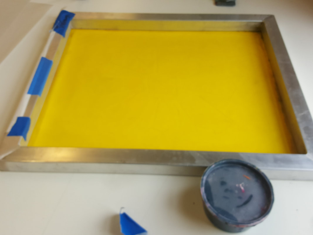
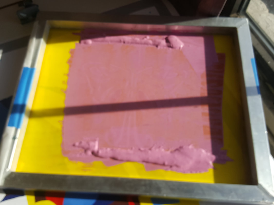
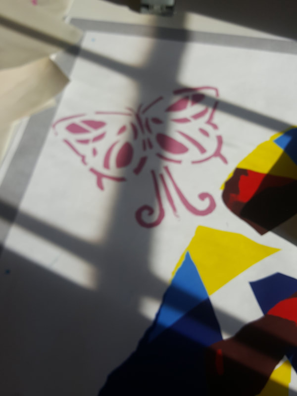
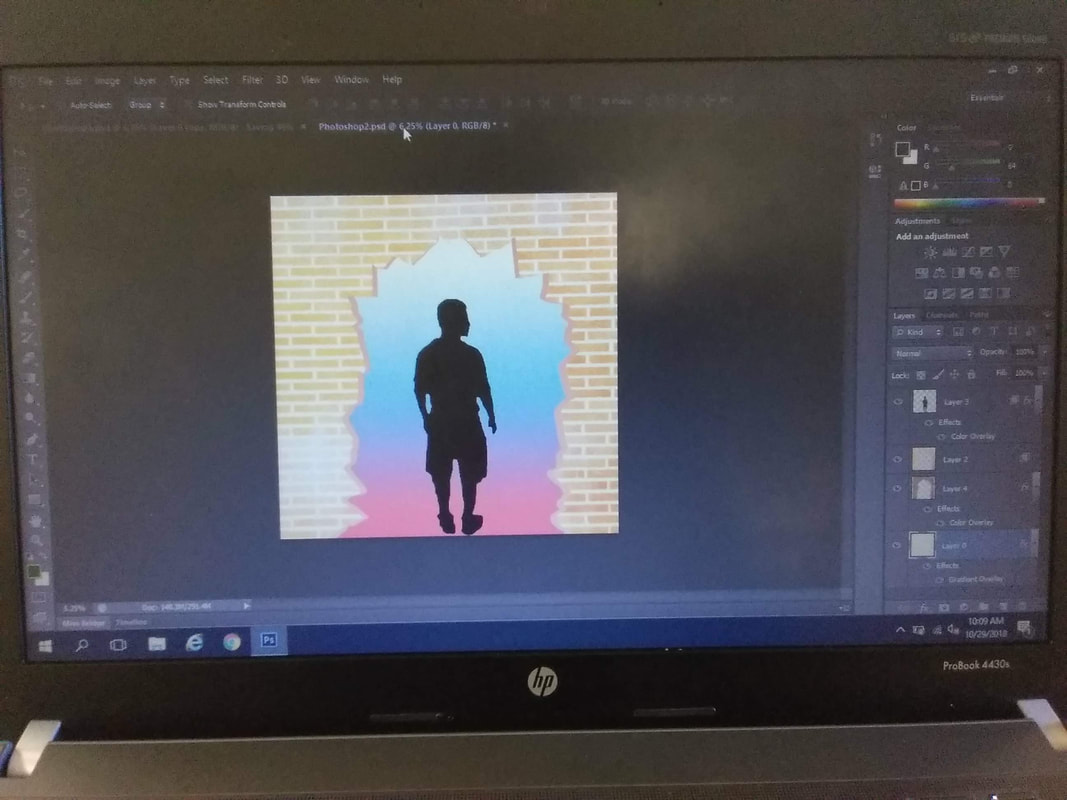
For "Equal In Color" specifically I used a solid color layer so no details would be shown from the faces. Scarlet red, Bumblebee yellow, Maroon, Deep Sky Blue, and Navy blue were the colors I used for "Equal In Color". Each color represents a different populous, the Whites, the Blacks, the Hispanics, and the Asians. The blue in the piece is arguably the majority color, which would signify the white populous in Wisconsin (The Deep Sky Blue represents the white populous that is aware of Milwaukee's "condition" and segregation and the Navy blue would be the unaware whites, the ones "in the dark"). The Maroon, Scarlet Red, and Bumblebee Yellow represent the Asian, African American, and Hispanic populous. Considered the minorities, these three cultures have had a hard fought bloody road to get where they are today in America, and with sunshine barley shining through, they pulled through. For the "Wall Of Reality" piece, I brightened the original color of the wall, and copied that image. The copied image on the previous layer was made darker. I then used the "Free Transformation" tool to create the effect of a 3-D wall breaking instead of just a 2-D wall. Behind the wall was the colors red, blue, and white which are not only the "American" colors, but they mean something in their own right as well. Red is associated with anger and hate, while blue represents sorrow and empathy. The white part embodies these two ideas of hate and empathy through racism, segregation (red) and effort to stop racism and segregation (blue). While the wall represents what Milwaukee hides behind. The idea that Milwaukee is just another city with a small amount of segregation, that it's not that bad, which is absolutely not the case. Next was the silk screening of the stencils onto the piece. For "Wall Of Reality" I used flowers to signify the beauty that people see in Milwaukee, the history, the atmosphere. That wall is breaking into reality, the reality that not everything in Milwaukee is what it seems. For "Equal In Color" I used multiple stencils, I used butterflies which signified the beauty that Wisconsin has as a whole, regarding the history, the atmosphere, the diversity, and the overall eye appealing nature of Milwaukee. I used two circular stencils to add an element of simplicity to the piece; each group of circles represents a diversity in the community. The world equal has two meaning, being equal in difference is different than being equal in life (laws, segregation, racism). |
Reflection
These pieces "Equal In Color" and "Wall Of Reality" weren't the longest of projects, they didn't take as long as previous projects but the meaning behind it was strong. I think that overall, the artworks I created were exceptional in the idea I was trying to portray of breaking through the wall of beauty, forgetting about what is seen on the outside, and learning, submitting yourself to reality. The "Wall Of Reality" piece took longer to plan out than it did to execute but their is a reason for the simplicity. I wanted to portray the idea of a literal wall of beauty, hiding what it truly means to live in Milwaukee. The broken wall was something that took little thought, you're breaking through the wall, and entering reality. What I decided to do was put the iconic flag colors, red, white, and blue but I changed up the order to signify difference in the meaning of the colors. If I was more experienced with Photoshop, I would have put drew a city burning, but I didn't truly know my idea of the positioning, and where things were truly gonna go. I feel like the burning city would of have signified more of a meaning, but I was also worried that the people in the community would see it, and think I am trying to say this city is terrible which it absolutely is not. I would of had to found some way of showing my meaning, with more planning and careful step making.
My piece "Equal In Color" was created to show once again that beauty is hiding the truth about Milwaukee. This piece focuses more on diversity, and how you may be diverse, you may belong to a different culture, but you are a part of this Milwaukee community. This piece turned out exactly how I felt like it should have to get the point across that I wanted to get across. The lack of facial features gives the effect that how you look matters none. It is your culture, your community, and your experiences that determine who you are as a person. I would of liked to portray this more through the stencils. The stencils I used were showing beauty, and diversity, but the "EQUAL" in front of the piece is off centered. Even though that is how I planned it, It doesn't fit to the size of the piece, and without it being centered it looks squeezed in.
Both of these pieces embody the idea that behind the wall of beauty, their is a dark truth. "Wall Of Reality" through the white, blue, and red create a meaning to what's behind that wall. Comparing it to America's past dark truths while having a meaning in each color as well. As for "Equal In Color" the colors are there to show different cultures, and together those colors create the Milwaukee community, a group of different cultures put together in one community. Chuck Close's "Linda" and color adaptations of "Linda" show identity, and how in every new flaw, a person grows. An idea that a bunch of flaws create who you are, that's why there is so much detail in all of his work. In my pieces I used this idea conversely. I showed no detail at all, you couldn't tell anything about any of the people in the photo. All you know is their color.
ACT Questions
Clearly explain how you are able to identify the cause effect relationship between your inspiration and its effect on your artwork?
"Linda" by Chuck Close stood for an ideal, the belief that showing reality as it is and not what it's portrayed to be. But, this piece also represents the how imperfection and how you look make you the person that you are. My pieces both show similarly to "Linda", beauty and the effect that it has on the reality. But my pieces contrast on meaning, I chose to use no facial features to give off the impression that what you look like matters none, that you are a part of this Milwaukee community. For the color adaptations of "Linda" the use and change of color is used to show different details and meanings. My piece uses the same color technique of changing the color of a photograph intentionally, but once again I chose to use solid colors to show difference in culture, but no difference in community.
What is the overall approach the author has regarding the topic of your inspiration?
Chuck Close creates realistic images through photography, and paints them on an enlarged canvas showing all their imperfections. The piece "Linda" was made to show how imperfections make you the person you are. Not to be ashamed of these imperfections, but to use them to be free, free of self-doubt and self-hatred.
What kind of generalizations and conclusions have you discovered about people, ideas, culture, etc. while you researched your inspiration?
I knew that African Americans were treated differently, and I knew a lot about segregation in Milwaukee. But I didn't think we as a community were as bad as they proclaim. I didn't think we deserved being potentially the, "Worst place for Black people in America" until after I researched all the statistics and history the Milwaukee has had with different races in the past.
What is the central idea or theme around your inspirational research?.
The theme of both my piece's are that their is a hidden feature to the "Milwaukee Experience" that is hidden behind a wall, a wall that is protecting people for the truth. Also that their is beauty in Milwaukee, but that beauty can overshadow the truth.
What kind of inferences did you make while reading your research?
Well spending my entire life in Milwaukee and seeing these kinds of injustices and even living through them, but never hearing truly about them in schools or around neighborhoods made me inference that it's not very well known how truly bad Milwaukee is on segregation and racism.
Reference Page
Close, Chuck. “Linda.” Chuck Close | Linda, 1975-1976, Chuck Close, 2014, chuckclose.com/work059.html.
Close, Chuck. “Linda - Online Collection.” Linda, 1975-1976, Akron Art Museum, akronartmuseum.org/collection/Obj1715?sid=1&x=57183.
Downs, Kenya. “Why Is Milwaukee So Bad For Black People?” NPR, NPR, 5 Mar. 2015, www.npr.org/sections/codeswitch/2015/03/05/390723644/why-is-milwaukee-so-bad-for-black-people.
“African American.” VISIT Milwaukee, VISIT Milwaukee, 2018, www.visitmilwaukee.org/about-mke/diversity-and-inclusion/african-american/.
